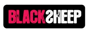
Black Sheep Identity Revealed
A 2010 rebrand flashback. ENJOY.
We know how difficult it can be to nail down an identity. Creating our logo design over the past few months has been exhausting! There were so many things we wanted to say with one little image: we like to create awareness through a handmade, grassroots approach, we’re edgy but not angry, we’re trendy, but here to stay… the list could go on and on. So many designs came through our door, but nothing said it all.
Until now. Drumroll please….
TA DAAA!
What we realized is that, like most other facets of marketing, to get what we want, we’re going to have to break a few rules. Even we would have never guessed pink.
Rule #1 – Logos should be something that last forever. True… sort of. Yes, you want to create something that has longevity, but that doesn’t mean it has to always stay the same. Take a hint from Google and AOL – they change their look up all the time to fit their mood, current project or for a little extra flair. So for our logo, we have several different fluorescent color options all available with or without the black box. The ability to change things up speaks to our dynamic, unpredictable nature.
Rule #2 – Logos should appeal to your audience. Wrong. Logos should appeal to the audience you want. Sure, we could have created something that looked like a financial institution or healthcare company, but that’s not what we are, and few companies of that persuasion are likely to be open to our progressive practices (even though they should be). Our philosophy is important to us, and we’re not trying to hide it. That’s why we chose fluorescent, punk-inspired colors, lots of black and an artistic design. We’re bold, we’re rebellious and we’re creative. Mission: accomplished.
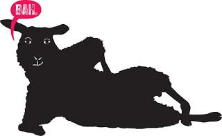
Rule #3 – There are logos with icons and logos without icons – you can’t have both.Well we just did. Because we love our name and everything it stands for, we were pretty adamant about having a sheep icon. But, combining the sheep with the typeface was overwhelming and cumbersome, so we decided to create an icon and a typeface. Sometimes we use one, sometimes we use both (strategically). Whatevah, we do what we want.
So there you have it. Take risks and make sure your brand identity is just that – your business’ personality, not what other people want it to be. Want to see what we're up to a decade later? Time travel and check us out in 2019.