Creating a 360-Degree Brand
In 2016, iconic Houston institution Bering Omega merged with Houston Area Community Services (HACS) to form one big super-org focused on community medical care. The resulting powerhouse was namedAvenue 360 Health & Wellness—“Avenue” for the simple, friendly pathway to care and “360” for the huge variety of services offered. Avenue 360 provides everything from medical and behavioral health to dental services, help with housing and even more specialized support services.
As passionate as Black Sheep is about organizations showing up in a big way to do good in the community, we were proud to help these two organizations dig deep, brainstorm and ultimately create their new name and new brand. We began as we always do: looking at the orgs’ history. Bering Omega opened its doors to Houston’s AIDS community in the early 80s when few were addressing the epidemic, and HACS was founded later for a similar reason, though it quickly expanded into care for all, including housing support and behavioral health.
It became clear early on in Black Sheep’s research that one thing each organization had done well was to support the individual, seeing their struggle, their loved ones, their life, their story. And that became the crux of the new brand going forward.
The Logo
Avenue 360 is a new kind of medical home—one that’s about being there for the individual with medical attention and advice when needed. The new logo reflects the individuality of the people who trust Avenue 360 with their care and the medical expertise provided to them and their families. Avenue 360 cares about every household, every inhabitant—and they enable each to pursue their own health for their own reasons.
The Brand
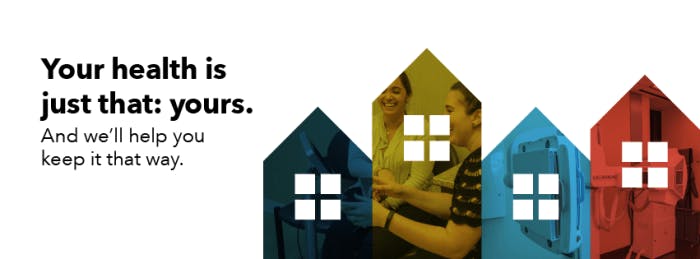
The new Avenue 360 is for all Houstonians, and we wanted everyone to feel confident and at home with the new org. To do that, we used the modern house motif from the logo and expanded it into an entire brand story. This brand focuses on empowering the individual and their family, and honoring how they live their lives and spend their time. The die-cut windows and rooflines invite our audience to look through the window and into the lives of the types of people Avenue 360 serves: everybody.
The four-color color palette is vibrant but mature, inviting but modern. Typefaces are clean, with a variety of visual texture, and photography is true to life and depicts, in most cases, actual Avenue 360 employees and facilities.
And Avenue 360 Health & Wellness’ website went live recently! So while their name and look has changed, the incredible service and 360 degree approach to their patient’s health is NOT changing. Avenue 360 occupies a special place in the landscape of Houston’s medical care, and a special part of our hearts for that same reason. They’re building a solid story, a sturdy brand and a stable community around themselves to fully encapsulate what it means to be Avenue 360.

