Popping the Cork on a New Brand
In the last several decades, Boys and Girls Harbor has done amazing work. For 70 years they have been steadfast in caring for our region’s abused and neglected children.
But, in spite of having successfully lived their mission for this many years, the organization has struggled to activate the community around them. While the stories of children who have experienced abuse and neglect are not new, Boys and Girls Harbor is constantly challenging themselves to continue bettering the future of the children lucky enough to come into their care, and they’re in need of a new audience to help. It’s time for people to know exactly who they are, and that begins with a new name and a new brand.
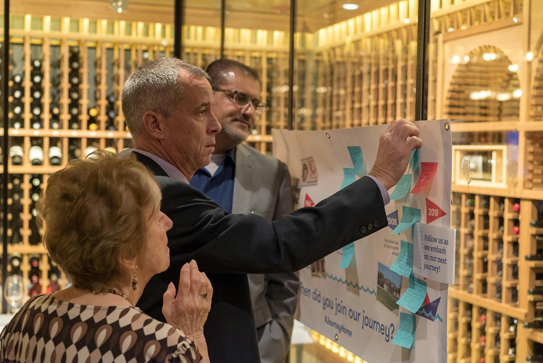
They’ve now become Today’s Harbor for Children, and their new descriptor, “A community for our youth,” conveys the idea that we share a responsibility for the children in the greater Houston area. It launched last week, accompanied by a new visual brand.
Boys and Girls Harbor has had a few faces in the 70 years of their organization, but their old logo had run aground a decade earlier and their brand lacked storytelling capability. And, like all the best clients, they knew it.
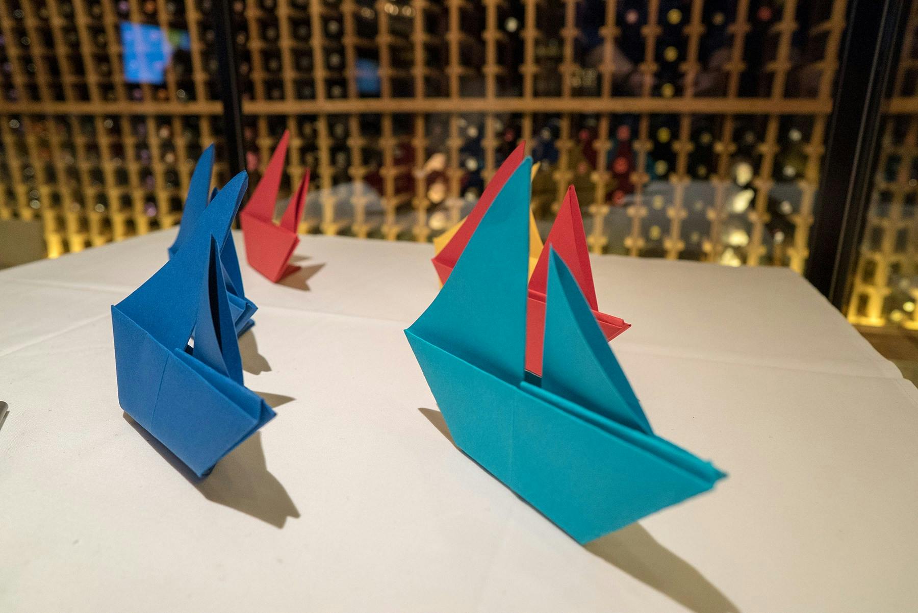
Our design team was challenged to make the new logo and other visual brand elements appropriate for the entire range of children at the harbor—kids from elementary school to 18. Sure, the brand needed to feel child-friendly to dance on the heartstrings of donors, but the kids at Today’s Harbor for Children have to live with the new brand. Literally. So when we jumped into our initial visual research, we kept this consideration top of mind. We were particularly excited by our research on the International Code of Signals, the visual maritime code used by ships all over the world. All ships have on board a set of flags comprised of simple symbols (circles, rectangles, triangles) in a limited color palette that enable them to visually communicate to other ships. It was at this point that we recognized mutual goals: Much like ships need to communicate their mission and intentions to others on the sea, Today’s Harbor for Children was looking to communicate their work to a larger audience.
We borrowed an assortment of simple shapes and a large part of our color palette from the maritime code. The bright but limited colors and geometric imagery were appropriate for all age groups, and we added graphic “wind” and “water” elements to help further our illustration capabilities. A delightful hand-made screenprint texture added over the top of all the graphic elements brought warmth and very human element to the system of shapes. When parts of the system are combined, they can feel serene or dynamic, like the sun on the sea or like pennants blowing in the wind. They can interact with photos; they can be stark or busy, vibrant or monochromatic.
We even used these shapes to build Today’s Harbor for Children their logo, a poised paper ship on an even sea. Paper boats are symbolic of childhood, optimism and possibility, and this clean-yet-textural logo speaks to the structure the organization brings to the lives of children.
Why a ship?
There’s the obvious association of the organization’s location on the water, but the why goes further than that: Every ship is unique—in name, in crew, in design. Yet, they all share the singular purpose of moving you to your destination. At Today’s Harbor for Children, it’s up to the individual to make that journey, even if the waves crash against them and the tides carry them to unexpected places. But it’s the journey that shapes these children, and it’s the goal of Today’s Harbor to put the right people and environment around these kids to help them along the way.


There’s a lot of ceremony and celebration around the naming of a boat, and the day Boys and Girls Harbor became Today’s Harbor for Children, was no different. We’re proud to get to own even a part of helping to spread awareness of this wonderful organization and the work they’re doing to make sea-worthy young citizens.
Cheers. [SMASH.] Sail on.